
A couple tattoo is only as meaningful as its design. The words you choose matter. But the font those words are set in — how the lettering looks, feels, and connects — is what makes two separate tattoos feel like one shared story.
This guide covers everything you need to know about choosing matching couple tattoo fonts, and how using an AI tattoo font generator helps you create a cohesive lettering design that holds real meaning for both people.
Why Font Consistency Matters for Couple Tattoos
Couple tattoos come in many forms. Some are matching images. Some are complementary designs — two halves of one whole. And some are lettering tattoos: names, dates, phrases, or single words that connect two people.
When the design involves lettering, font consistency is everything. If one person has their tattoo in a clean modern serif and the other has theirs in a heavy gothic script, the tattoos look like they belong to two entirely different concepts — even if the words are related.
The font is what creates visual unity. It's what makes two tattoos read as a matched set rather than two separate pieces that happen to share a theme.
And this matters beyond the aesthetic. When you stand side by side and the lettering feels cohesive, the tattoos communicate partnership. They look intentional. They tell a story at a glance.
Popular Couple Tattoo Lettering Concepts
Before choosing a font style, it helps to know what kind of couple tattoo lettering you're working with. The most common concepts include:
Matching Names Each person gets the other's name. This is one of the most classic couple tattoo choices. Font style here carries huge emotional weight — delicate script feels romantic and intimate, while bold lettering feels strong and committed.
Complementary Words or Phrases One person has "always," the other has "forever." One has a first line, the other the second. These split-phrase designs require very close font matching because the two tattoos are designed to be read together.
Coordinates or Dates A shared date — an anniversary, a first meeting, a wedding day — is a popular minimalist choice for couples. Clean, structured fonts work best here. The numbers need to be readable and precise.
Initials Simple, elegant, and personal. Initial tattoos in matching script or calligraphy styles are understated but deeply meaningful.
Quotes Split Across Two People A longer quote divided between two people requires careful typography planning. The fonts must match exactly, and the sizing and spacing need to be coordinated so the full quote reads correctly when both people are together.
How to Choose Fonts That Match Without Being Identical
Here's a nuance that most couple tattoo guides miss: matching fonts doesn't always mean using the exact same font.
Sometimes two people want slightly different expressions of the same style. One person might want their version slightly bolder. One might want a subtle variation in the letterform. The goal is visual harmony, not visual cloning.
The best approach is to choose a style family and explore variations within it. Both people choose from the same style — say, flowing calligraphy scripts — but each selects the variation that feels most personal to them. The result reads as matched and intentional while still feeling individual.
An AI tattoo font generator is ideal for this process because it produces multiple variations of the same style quickly. You can both browse within the same style category and find the specific rendering that feels right for each of you.
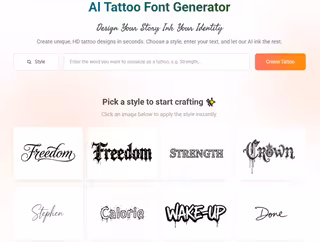
Using a Tattoo Font Generator to Design Together
This is the part that most couples skip entirely — and it's the most important step.
Most couples decide on their tattoos separately, show up to the studio, and hope everything looks right together. Sometimes it does. Often it doesn't.
Using a tattoo font generator together — in the same session, looking at the same screen — transforms the design process. Here's how to do it:
Start with your words. Type each person's word or phrase into the generator. See them rendered side by side in the same style.
Browse style categories together. Don't divide and conquer. Look at the options together and react in real time. One of you will immediately respond to certain styles. That reaction is data.
Generate matched and near-matched variations. Try the exact same font for both. Then try slight variations — one slightly bolder, one slightly lighter — and see which approach feels better.
Test the full design together. If your tattoos are meant to be read as a set, put the two generated images side by side and look at them as a unit. Does the lettering feel cohesive? Does it tell a complete story?
Finalize and share with your artist. Export both font renderings and share them with your tattoo artist together. Explain the relationship between the two pieces so they can ensure consistency in execution.
What to Avoid with Couple Tattoo Fonts
A few common mistakes to sidestep:
Choosing fonts from completely different style families. A delicate thin script paired with a heavy blackletter does not read as a matched set. Stay within the same style family.
Picking fonts without seeing them at tattoo size. Always preview at scale. Fonts that look matched on screen can look very different when one is tattooed at 3cm and the other at 5cm.
Rushing the decision. Couple tattoos are permanent. Take the time to explore multiple options in the generator. The right font will feel right to both people — not just one.
Forgetting placement. A matching script font looks very different tattooed on an inner wrist versus a forearm. Consider how placement affects the visual weight and scale of each person's tattoo.
Final Thoughts
A couple tattoo is a permanent expression of a shared story. The words carry the meaning. The font carries the feeling. Getting both right requires more than a quick scroll through a font catalog.
Use an AI tattoo font generator to explore, compare, and finalize your lettering design together. See your actual words rendered in actual styles. Test them side by side. Walk into your appointment with a clear, matched visual reference.
The extra care you put into the font choice is exactly what makes the difference between a couple tattoo that feels truly intentional and one that just feels like a coincidence.
На правах реклами


